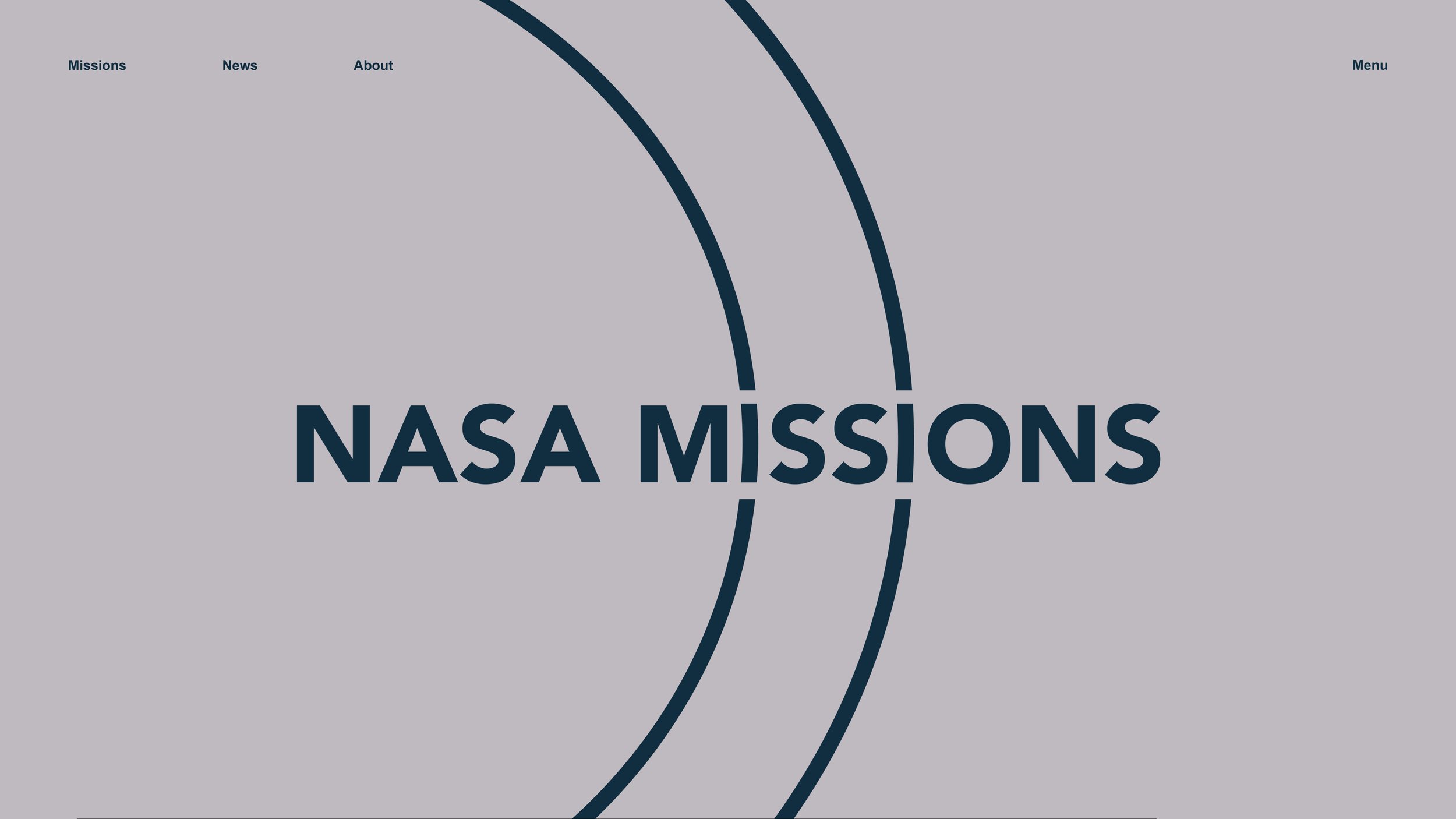
The NASA Design Book is a refresh of the current NASA visual identity. The project is centered around typography’s ability to create a visual language. Alongside a final printed and hand-bound design book, this project includes multiple print assets.
DURATION
January - June 2021
COURSE
Typography II
MENTOR
Todd Linkner
CREATIVE ACTIVITIES
Brand Identity
Logo Design
Book Layout
Print Design
Web Design
NASA Redesign
For my Typography 2 course, I was assigned to create a new visual identity for an existing company chosen by my professor: NASA. Beginning with space missions poster designs, the semester was spent building upon a visual language which included stationary pieces and web design. These pieces became a part of the design book for my NASA redesign. Though each element of this project serves a different purpose, the cohesive designs throughout maintain the same visual identity.
Design Book
The culmination of this project was the design book, illustrating the visual elements and design applications of the pieces. The book design itself uses the visual language of the rebrand, though to an appropriate extent to provide the upmost clarity.
Posters
Pictured below is the poster series for the NASA space missions Ulysses, Magellan, and Clementine. As this project was for a typography class, I decided to base the visual language around type alterations/continuations. The orbital rings are seen throughout the pieces.
Stationary
Pictured below are the stationary pieces created. Since these act as the most functional pieces, their designs had to be more simplistic to avoid illegibility while maintaining the visual language.
Web Design
Pictured below are the stationary pieces created. Since these act as the most functional pieces, their designs had to be more simplistic to avoid illegibility while maintaining the visual language.


