NYFF Booklet:
Typography One
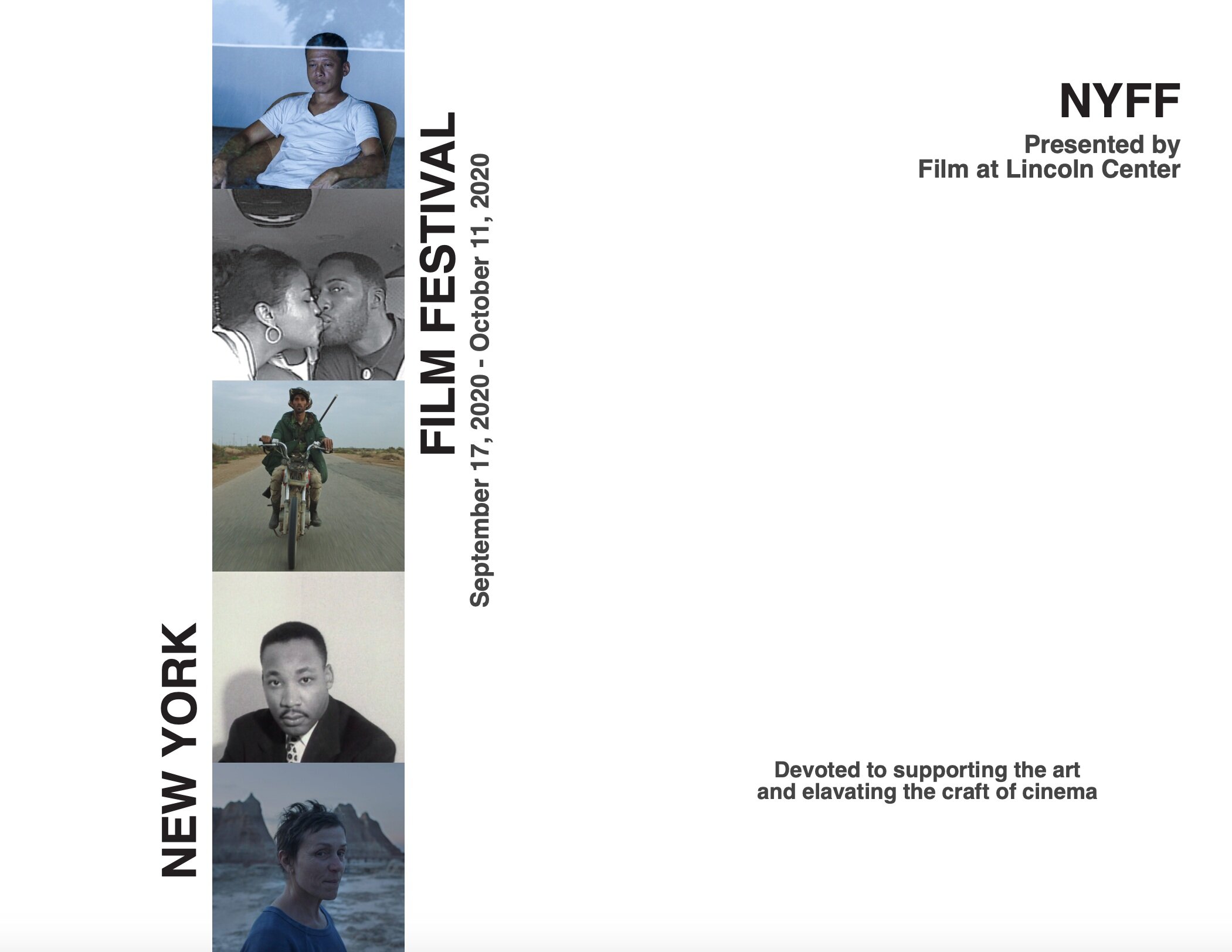
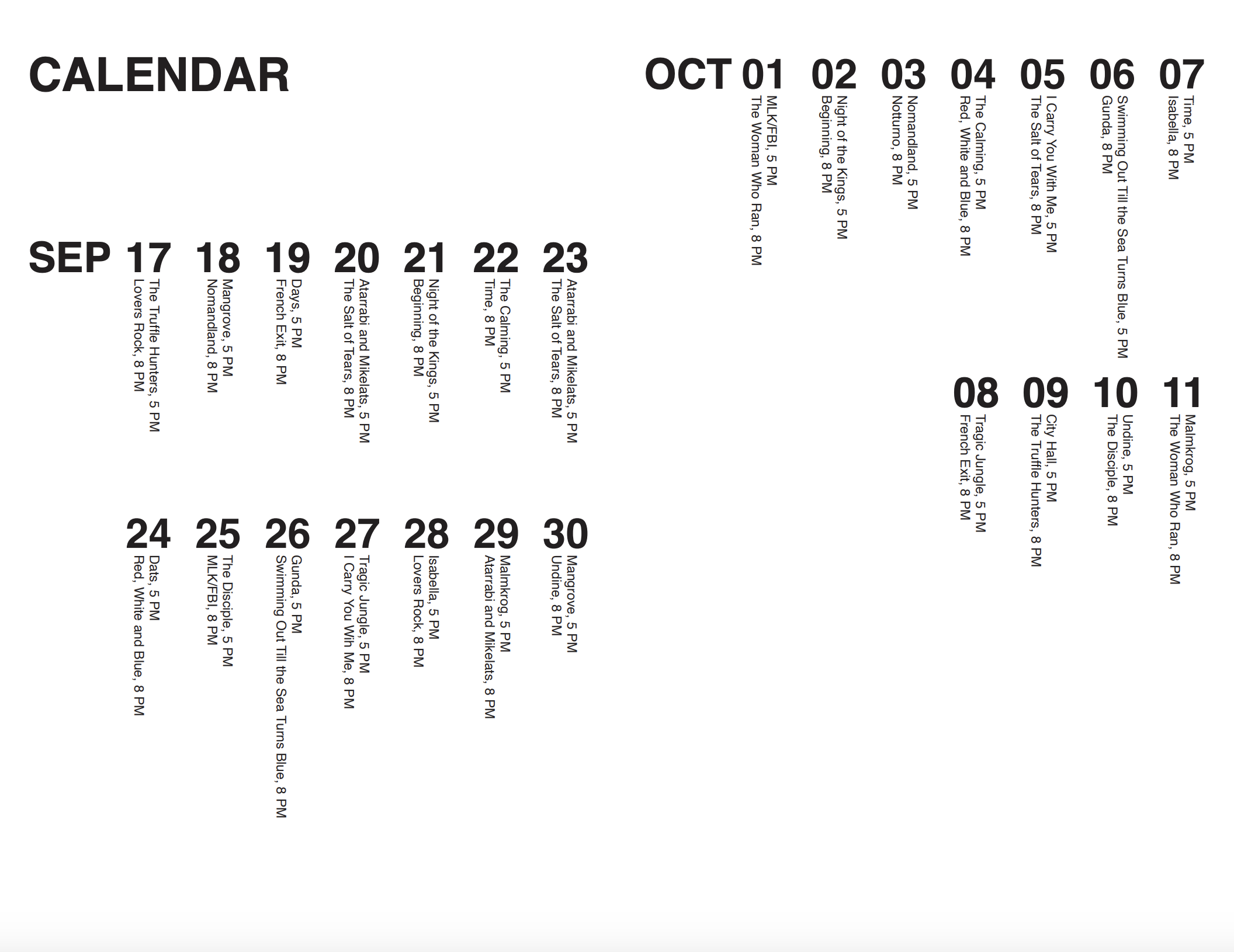
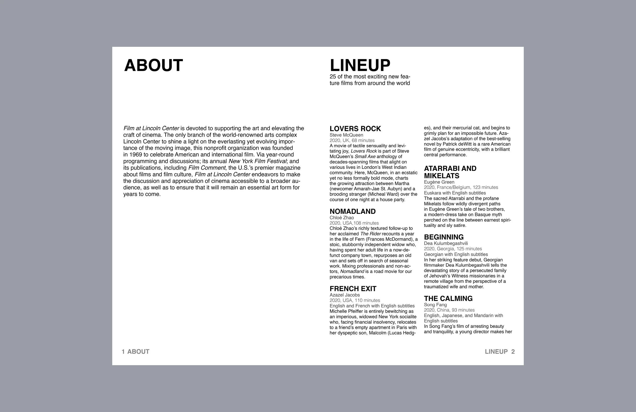
As the final project for Typography 1, I was assigned to design a booklet for the New York Film Festival using provided content by the professor. Though on the one hand this project is a demonstration of technical typography and design layout skills, there is an element of unifying individual pieces under one universal visual system as well. Composed of various elements - lists, calendars, front and back covers - each are meant to relate to one another in order to maintain the identity of the project as a whole.


Process
Below are explorations and first drafts of this project before finalizing the work above.
The first three are my initial cover designs. As this was a type class, I decided to continue with the iteration on the left as I felt it most successfully utilized the text as a visual language. Seeing as this was a cover for New York Film Festival, I aimed to replicate the feel of a film reel while still clearly providing the information. In my final cover, the title and dates are much more concise and integrated into the design, as well as consistent with the back cover.
The two below were some of my earlier lineup and calendar drafts. I felt as though the lineup draft did not match the overall identity of the booklet as well as it could, so I worked on connecting it more to the visual language of the covers and calendar. Though I liked the direction the calendar draft was going, I knew it needed to be clearer.